Phoenix — Initial Onboarding

Persona walkthroughPersona: PriyaNew

1 high4 medium1 low
Persona walkthrough
One persona moves through the flow screen by screen. Every finding is anchored to a specific screen where they would hesitate, misread, or stop — not to a general usability principle. Doesn't critique visual design or propose specific copy rewrites; those are separate review types.
Priya — Bitcoin-curious newcomer
Downloading her first wallet. Comfortable with banking apps, but "seed phrase", "sats" and "Lightning" mean nothing to her. Cautious, and worried about losing money or being scammed.

Generated automatically and not manually verified. Findings quote the screens they reference so they can be checked against the originals.

Summary

Phoenix gets Priya from launch to a working wallet in four taps, and it does the hardest thing well: self-custody is disclosed as its own dedicated screen, in plain language, before she creates anything. The flow's weak point is the sentence immediately after that disclosure — "Keep it safe!" instructs her to protect a secret key she has not been shown, cannot reach, and is never prompted about again before the flow ends. She arrives at an empty wallet denominated in a unit no screen introduced, with no suggested next step.

Walkthrough

  1. 01 Onboarding 1st screen

    101 Onboarding 1st screen

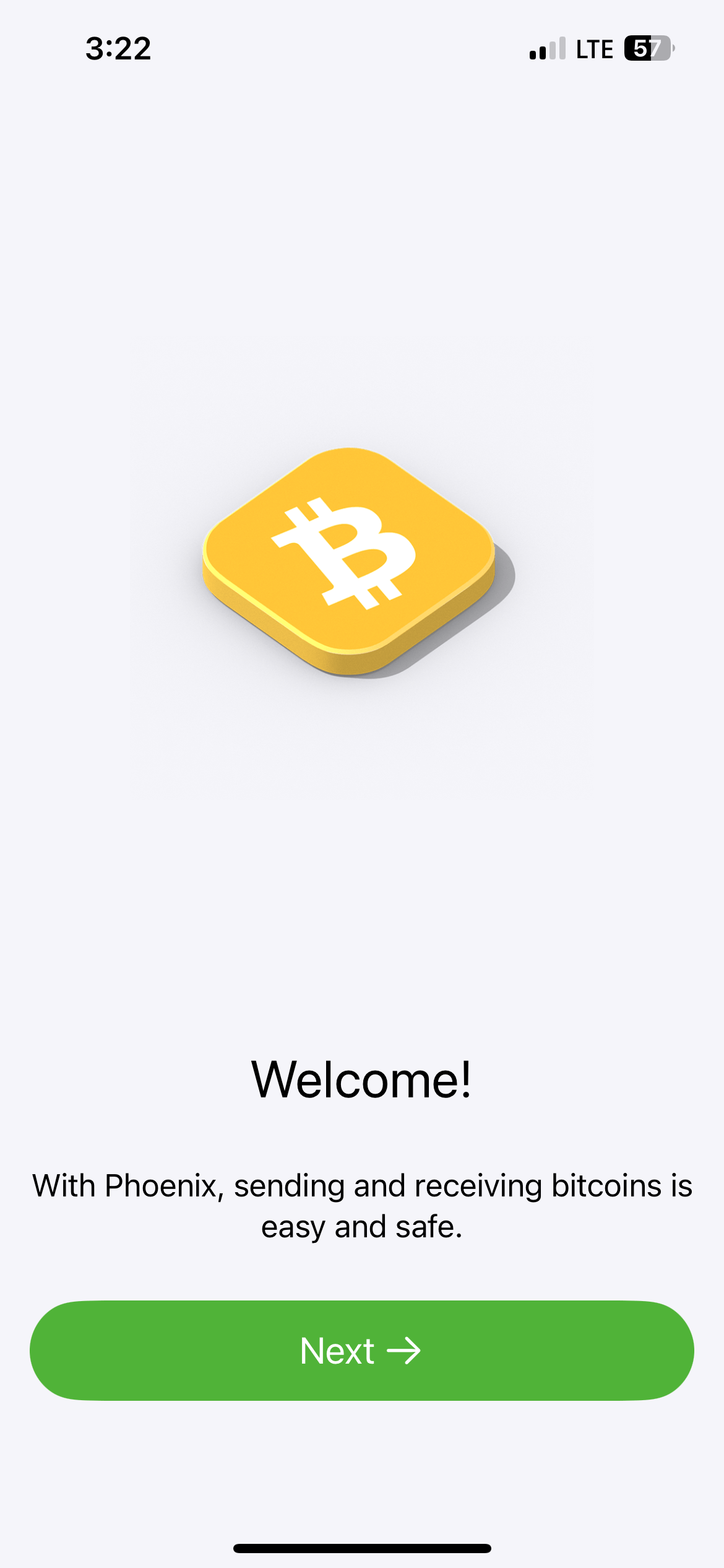
    "With Phoenix, sending and receiving bitcoins is easy and safe." Nothing here requires vocabulary Priya lacks, which is rarer than it sounds — most wallets spend their first screen on a claim she'd have to decode. She taps Next.

  2. 02 Onboarding 2nd screen

    202 Onboarding 2nd screen

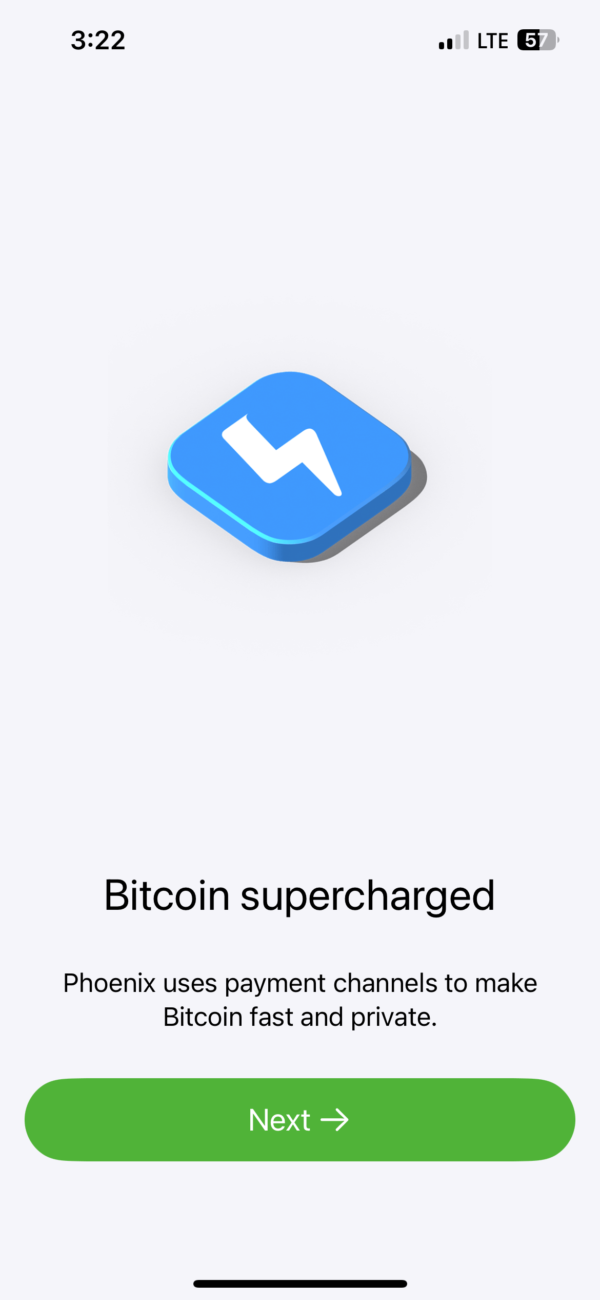
    This is where she hits her first wall. The screen's job is to explain why Phoenix is different, and the explanation is "payment channels" — a mechanism she has no referent for. She takes away only that something technical is happening, which is not what this screen is for.

  3. 03 Onboarding 3rd screen

    303 Onboarding 3rd screen

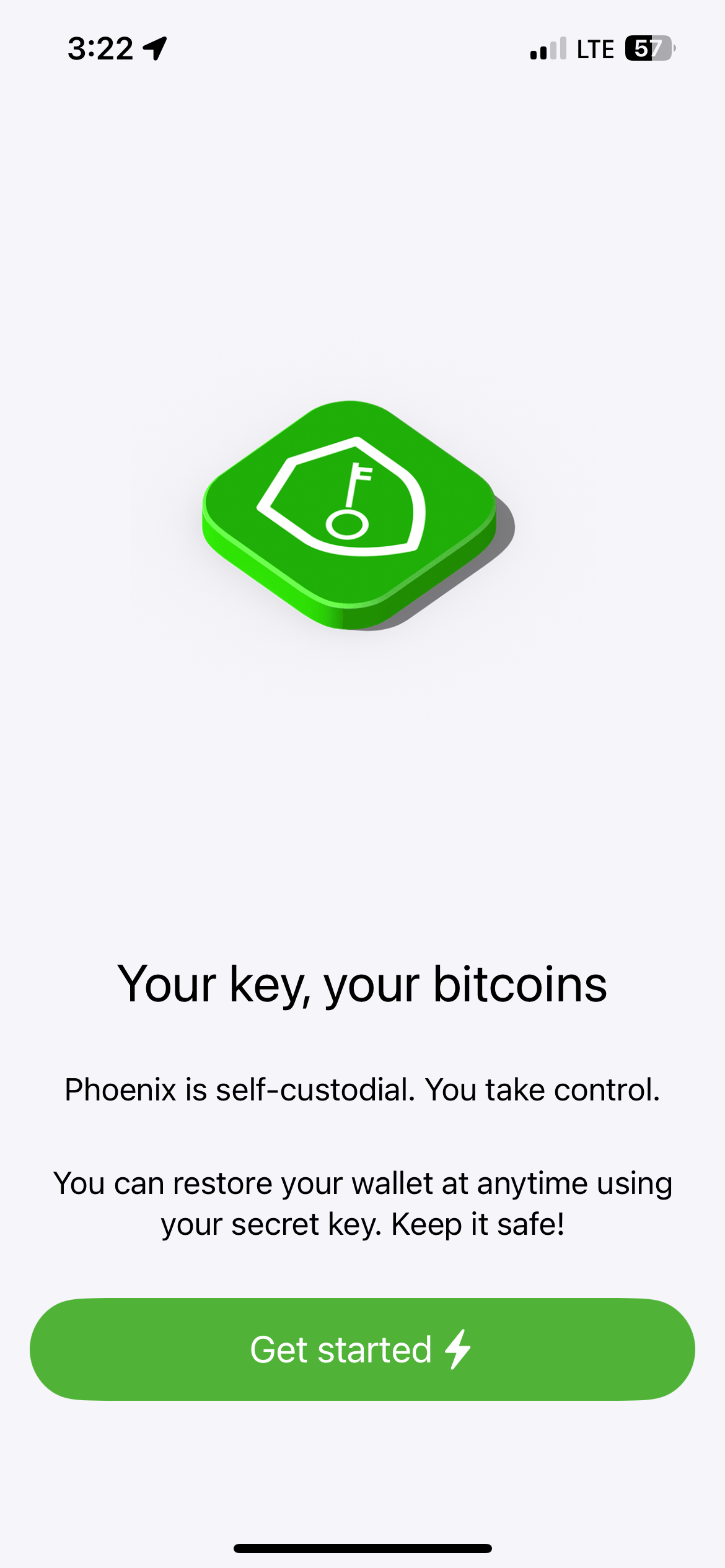
    The strongest screen in the flow, and the one that most affects her. "Phoenix is self-custodial. You take control." is plain enough to land, and it lands before she has created anything. Then the second line hands her a duty — "Keep it safe!" — for something she has not been shown and cannot reach. She is already anxious about losing money; this is the sentence that activates it, and the only button says "Get started."

  4. 04 Onboarding 4th screen

    404 Onboarding 4th screen

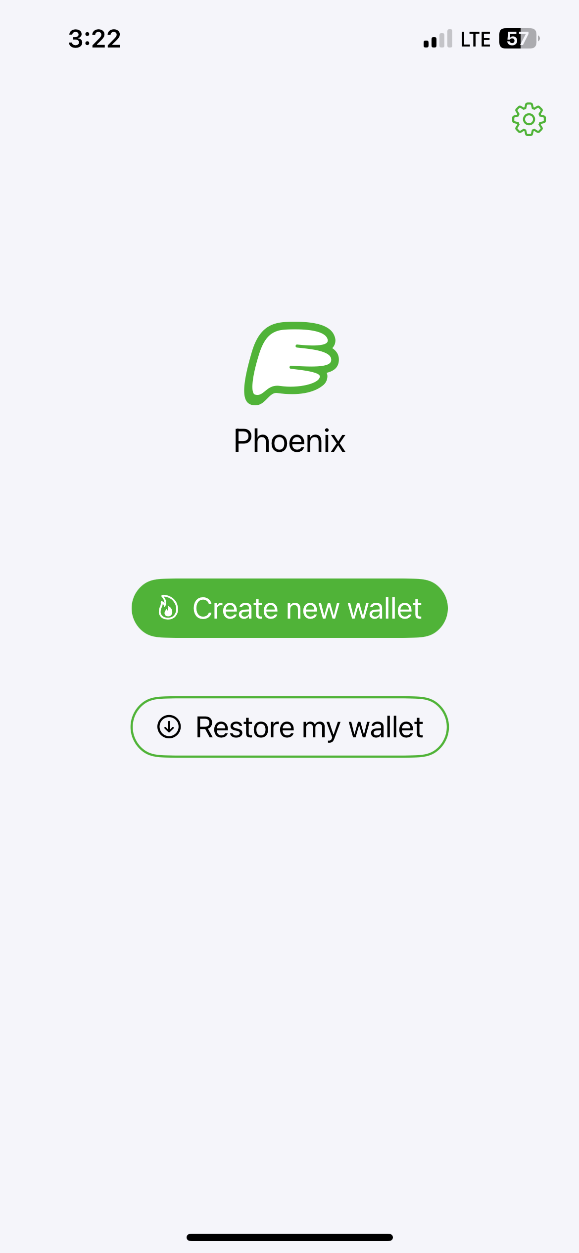
    Unambiguous for Priya. She has nothing to restore, so "Create new wallet" is the obvious choice and she takes it without hesitating.

  5. 05 After tapping create new wallet

    505 After tapping create new wallet

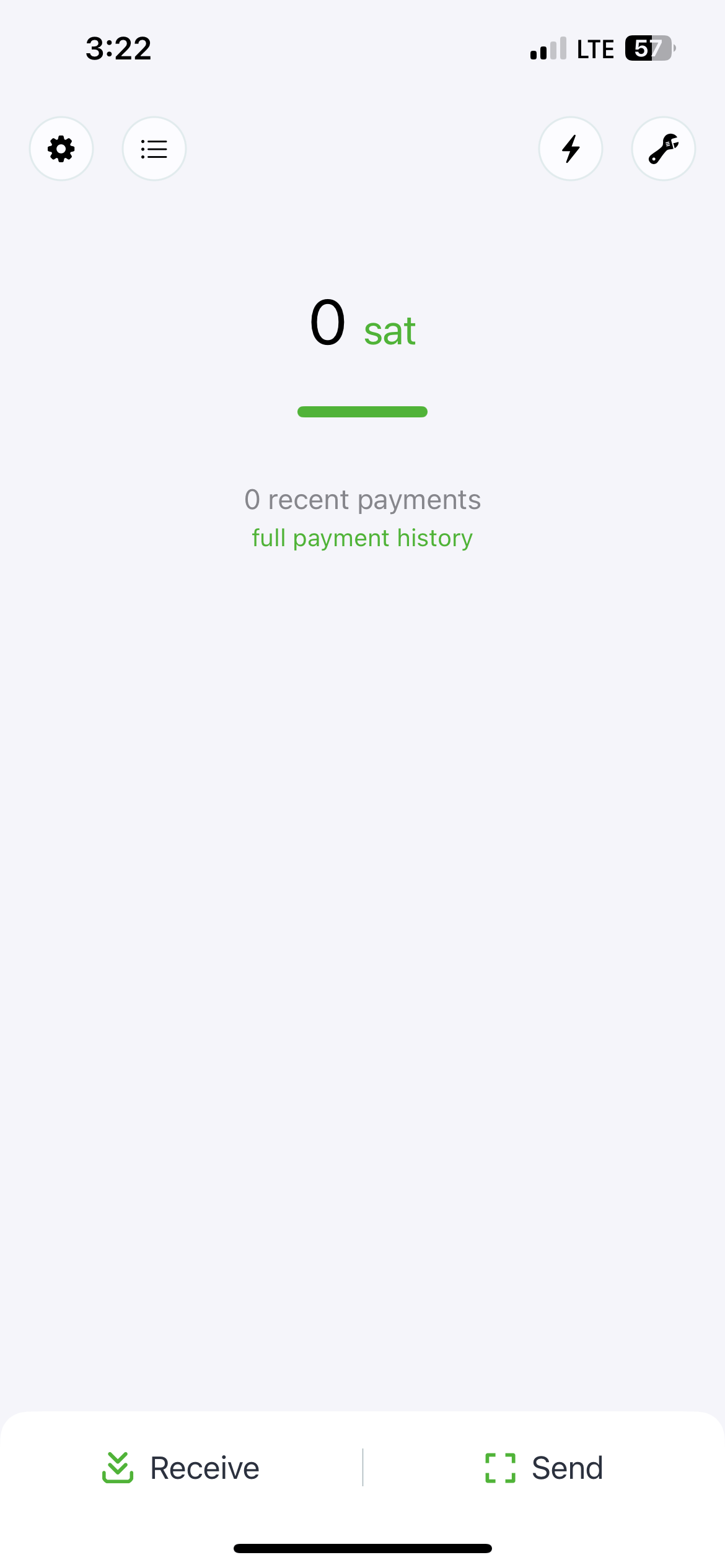
    Her flow ends here, and it ends without telling her anything. The balance is denominated in a unit no screen introduced, nothing invites her to fund the wallet, and the backup she was told to keep safe is never mentioned again. Four icons sit at the top, two of which she cannot decode.

Findings

  1. 1highTrust erosion
    You can restore your wallet at anytime using your secret key. Keep it safe!

    Priya is instructed to safeguard something she is never shown. No screen in this flow displays the secret key or offers a path to it, and Phoenix's backup flow doesn't begin until screen 17, reached through a warning message. The Design Guide treats backup as a dedicated step early in onboarding.

    Suggested fix Either bring the backup step into this flow, or reword to set expectations — "We'll help you save your recovery phrase in a moment." Don't assign a duty the flow gives no way to discharge.
  2. 2mediumConfusion
    You can restore your wallet at anytime using your secret key.

    Phoenix calls this a "secret key" here and a "backup recovery phrase" in its own backup flow. Priya learns one term, then has to recognise a different one later, at the exact moment precision matters most.

    Suggested fix Use "recovery phrase" in both places. It's also the term she'll meet everywhere else in the ecosystem.

  3. 3mediumConfusion
    Phoenix uses payment channels to make Bitcoin fast and private.

    "Payment channels" is the most technical term in the flow, and it is offered as the explanation rather than being explained. The screen meant to sell the product's core difference is the one Priya understands least.

    Suggested fix Lead with the outcome instead of the mechanism — "Send and receive instantly, with fees low enough for everyday amounts."

  4. 4mediumConfusion
    0 sat

    The first balance Priya ever sees is denominated in a unit no screen has introduced. She has no way to judge whether a sat is a lot or a little, or how many she'd need. (Persona-grounded; the Design Guide's first-use page doesn't address units.)

    Suggested fix Show a fiat equivalent alongside, or default new wallets to BTC with a one-time explanation of sats.

  5. 5mediumDrop-off risk
    "0 recent payments" / "full payment history"

    The flow ends with no next action. The Design Guide recommends first-use offer "options for users who don't have any bitcoin yet, and for users who do"; the only affordances here are Receive and Send, both of which assume she already knows what to do.

    Suggested fix Add an empty-state prompt for a first deposit, and surface the outstanding backup here rather than waiting for a warning to fire.

  6. 6lowConfusion
    Four unlabeled icons in the top bar: gear, list, lightning bolt, wrench

    Gear and list are guessable; bolt and wrench are not. Priya cannot predict what any of them does, on the one screen where she most needs orientation.

    Suggested fix Label the two non-obvious ones, or move them behind the settings gear.

What's working

  • Screen 3 is the flow's best decision and should be protected. A dedicated, plain-language self-custody disclosure placed before wallet creation is precisely what the Design Guide asks for — "these caveats mustn't be hidden" — and many wallets bury it. "Your key, your bitcoins" is memorable without being jargon.
  • Screen 1 carries no vocabulary Priya lacks. The flow earns a few screens of attention before spending any of it.
  • Three intro screens, then a choice. Short enough that even an impatient user reaches the wallet quickly.

Gaps in this review

  • Whether the three intro screens are skippable can't be determined from stills — no skip affordance is visible in the frames, but swipe behaviour isn't observable.
  • The transition between screens 4 and 5 isn't captured. If a backup prompt appears there, the first finding weakens considerably.
  • No error, loading, or permission states are in this flow's captures.
  • iOS only; Android may differ.
  • Screenshots entered the repo on 2025-10-23, so Phoenix may have shipped changes since.

Carried forward

First review of this wallet and flow — nothing to compare against.

A note on the reference link

The flow's curated Design Guide link, bitcoin.design/guide/onboarding/first-use/, now redirects to bitcoin.design/guide/daily-spending-wallet/first-use/. Worth updating in app/data/phoenix.json.