Summary
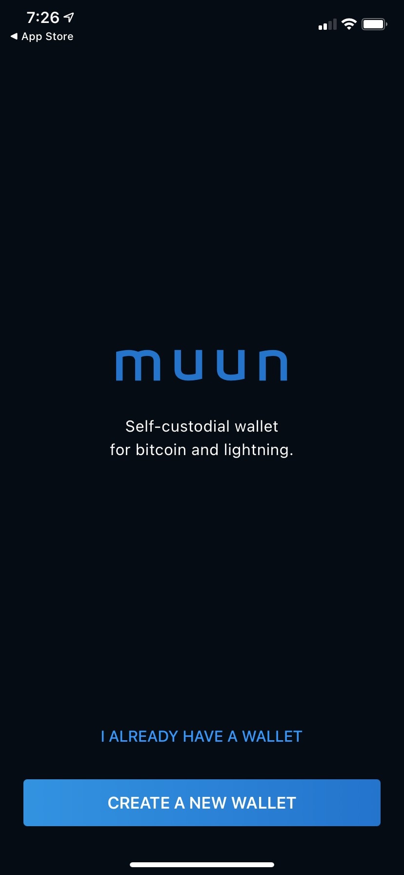
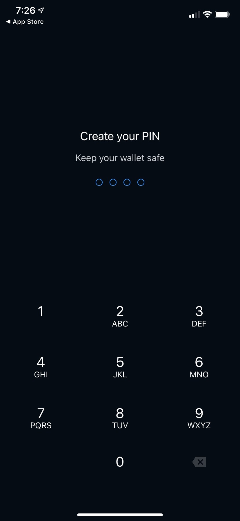
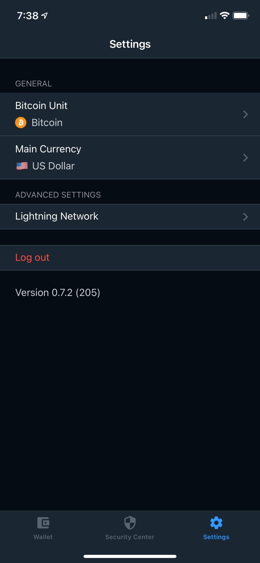
Muun's onboarding is four screens, two of which are a PIN, and its entire positioning is one line: "Self-custodial wallet for bitcoin and lightning." That sentence describes a category rather than a reason, and Phoenix could print it unedited — so the moment where Muun should be distinguishing itself is the moment it is least distinguishable. Meanwhile the genuinely distinctive thing about Muun, that you run a Lightning wallet without ever meeting a channel or a liquidity decision, is observable only by noticing what its four-row Settings screen doesn't contain. Muun has a real position; its onboarding declines to take it, and instead spends its only safety statement on a PIN.
Findings
Six findings, most severe first. Every observed string is quoted from the screenshot named in the same entry.
Muun against Phoenix
Phoenix is the yardstick here, not a co-subject: the question is what Muun's choices look like when something adjacent is held up beside them. Both are self-custodial Lightning-first mobile wallets, and both were captured in the Gallery on 2025-10-23.
|
Muun |
Phoenix |
| What onboarding claims |
One line: "Self-custodial wallet for bitcoin and lightning." |
Three screens: "easy and safe" → "Bitcoin supercharged" → "Your key, your bitcoins" |
| Self-custody disclosed before the wallet exists |
No |
Yes — a dedicated screen (03-onboarding-3rd-screen) |
| Screens to a working wallet |
4 (two are PIN entry) |
5 (three are intro) |
| Device lock during onboarding |
Yes — PIN, mandatory, unskippable in these captures |
No — App access lives in Settings |
| First balance the user sees |
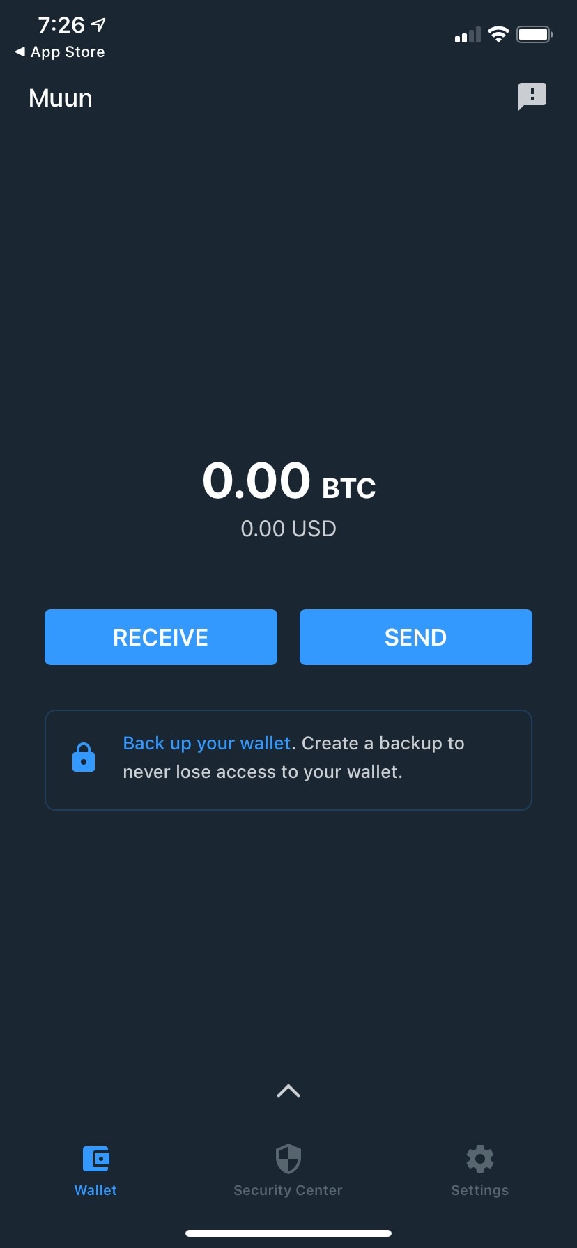
"0.00 BTC" over "0.00 USD" |
"0 sat", no fiat |
| Lightning machinery exposed |
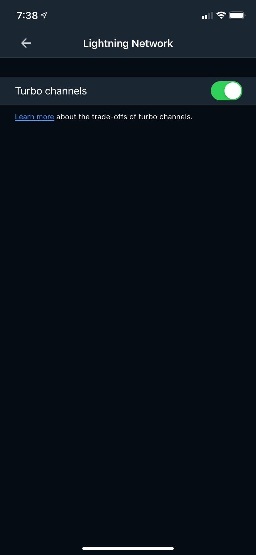
One toggle, "Turbo channels" |
Channel management, Add liquidity, Electrum server, Tor, and a six-screen liquidity flow |
| Backed up when onboarding ends |
No — home-screen banner plus a Security Center tab |
No — a warning row in Settings and a warning message on the wallet screen |
Where they clearly differ. Muun is built on the bet that the user should never see the machine; Phoenix is built on the bet that the user should be able to reach it. Muun's four-row Settings screen and Phoenix's Channel management / Add liquidity / Electrum server / Tor list are not two points on a spectrum, they are opposite answers. Muun also wins the first-balance moment outright: "0.00 BTC / 0.00 USD" is legible to someone who has never held bitcoin, where Phoenix's "0 sat" introduces a unit no screen has explained. And Muun's Security Center is a top-level destination with a three-step progress bar, against Phoenix's single Settings row.
Where they are interchangeable, which is the finding. The two screens that decide whether someone picks Muun — the welcome screen and the moment onboarding ends — are the two where the wallets are hardest to tell apart. Both lead on self-custody plus Lightning. Both put "create" and "restore" side by side with near-identical labels. Both end onboarding with an unbacked-up wallet and delegate recovery to a persistent warning on the home screen. Phoenix at least attempts a mechanism claim, however badly ("Phoenix uses payment channels to make Bitcoin fast and private"); Muun attempts none, so on the specific question of why this one, Muun currently offers strictly less than the wallet whose philosophy it opposes.
Who this appears to be built for
Read from the product surface alone: Muun's onboarding is built for someone who has already decided they want self-custody and does not want to be talked to about it. It explains nothing, assumes "self-custodial" and "lightning" are known words, offers restore as a peer to creation on the first screen, and gets out of the way in four taps. That is Dave's flow, not Priya's — except that Dave's other requirement, being able to reach fee control, node choice and coin control, is a requirement Muun's Settings screen deliberately cannot meet. So the flow is calibrated for a user Muun has no intention of serving past onboarding.
Everything downstream points at Priya instead: fiat alongside BTC by default, a Security Center that numbers backup 1–2–3, an Emergency Kit, no channel controls to misconfigure. The mismatch is not that Muun targets the wrong person — it is that the onboarding is pitched at a sophistication level the rest of the app doesn't assume, and the one line of copy that could correct that is spent on a category label. Marisol is not addressed anywhere in this flow.
Confidence: high that the product is built for a low-management, low-vocabulary audience — the Settings screen makes that unambiguous. Lower confidence on what Muun intends to be chosen for, precisely because the onboarding never argues for anything.
What's working
- The four-screen flow is an asset, not a deficiency.
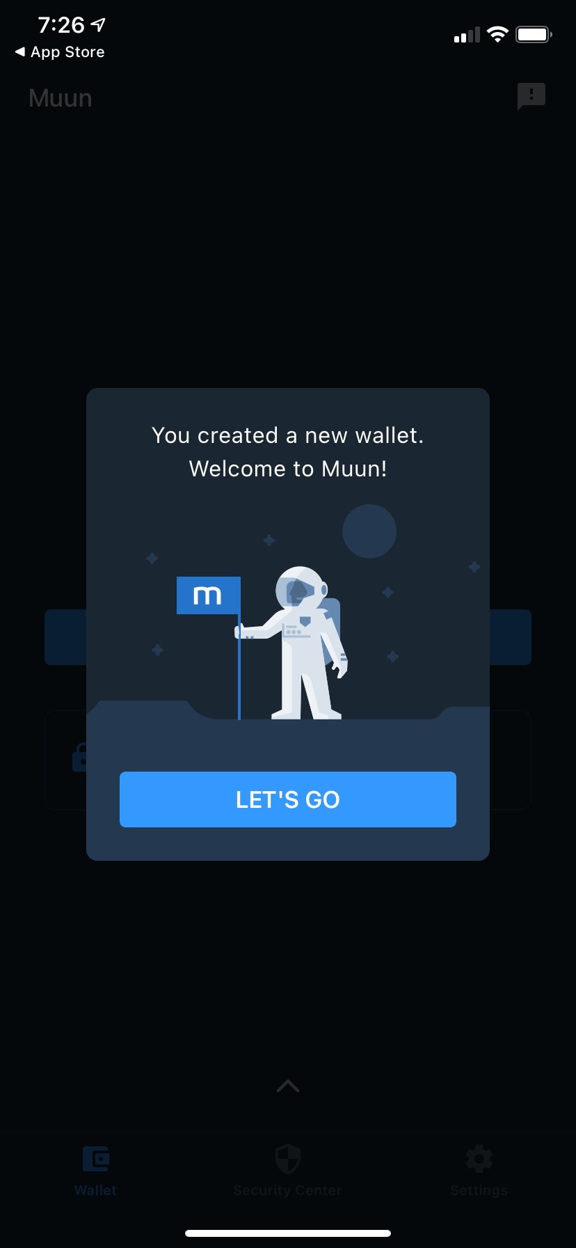
welcome-screen-with-wallet-creation-options to wallet-creation-success-screen-with-astronaut-illustration is the shortest route to a self-custodial bitcoin-and-Lightning wallet in the Gallery. The fix for the disclosure gap is one screen or one rewritten modal, not an intro carousel.
- "0.00 BTC" over "0.00 USD" on
main-wallet-screen-with-zero-balance-and-backup-reminder, with a single balance and no on-chain/Lightning split in the frame. This is the clearest in-product expression of Muun's actual position, and it is doing that work silently. Protect it.
- The Security Center is a top-level tab.
security-center-showing-backup-options opens on "Your wallet is not backed up" with a red progress bar and three numbered methods. Muun's depth is real; it is simply all behind the onboarding rather than in it.
- Settings restraint is a position, not an omission. Four rows and one advanced toggle is a coherent product decision that most Lightning wallets are unwilling to make.
Gaps in this review
- This is inference from the product surface only. Nothing here is a claim about Muun's real users, market share, funding or strategy; the review reads what the screens choose to say and not say.
- The "I ALREADY HAVE A WALLET" path is not captured. Given that the welcome screen gives restore equal billing, that flow likely carries positioning material this review can't see.
- No funding or purchase path is in these captures. The Design Guide's first-use page asks that onboarding support both receiving existing bitcoin and buying new bitcoin; whether Muun offers the latter can't be determined from the Gallery screens.
- The chat/support icon on the wallet screen is never opened. If Muun explains self-custody anywhere in-app, that is a plausible location.
- The capture may be old.
settings-screen-with-general-and-advanced-options reads "Version 0.7.2 (205)", and the wallet's Taproot screens are dated 2021-12-09, so the onboarding above may not match what ships today. Treat this as a baseline for the captured build.
- The Phoenix comparison rests on captured screens too — its Settings screen is cut off below the ADVANCED heading, so its full advanced surface is larger than what this review counted, which strengthens rather than weakens the contrast.
- Curated link. This flow's Design Guide link,
https://bitcoin.design/guide/onboarding/first-use/, still returns 200 but only to serve a client-side redirect to https://bitcoin.design/guide/daily-spending-wallet/first-use/. Same issue the Phoenix report flagged, here in app/data/muun.json.
Carried forward
No prior report on muun + onboarding, so this run is the baseline. One thread does connect to the 2026-08-17 backup copy review: it found "Back up your wallet" overloaded as a label across four different things inside the backup flow. That overload starts one screen earlier than that review recorded — the phrase is already doing duty as the exit banner on main-wallet-screen-with-zero-balance-and-backup-reminder, which is the first thing a user sees when onboarding ends.